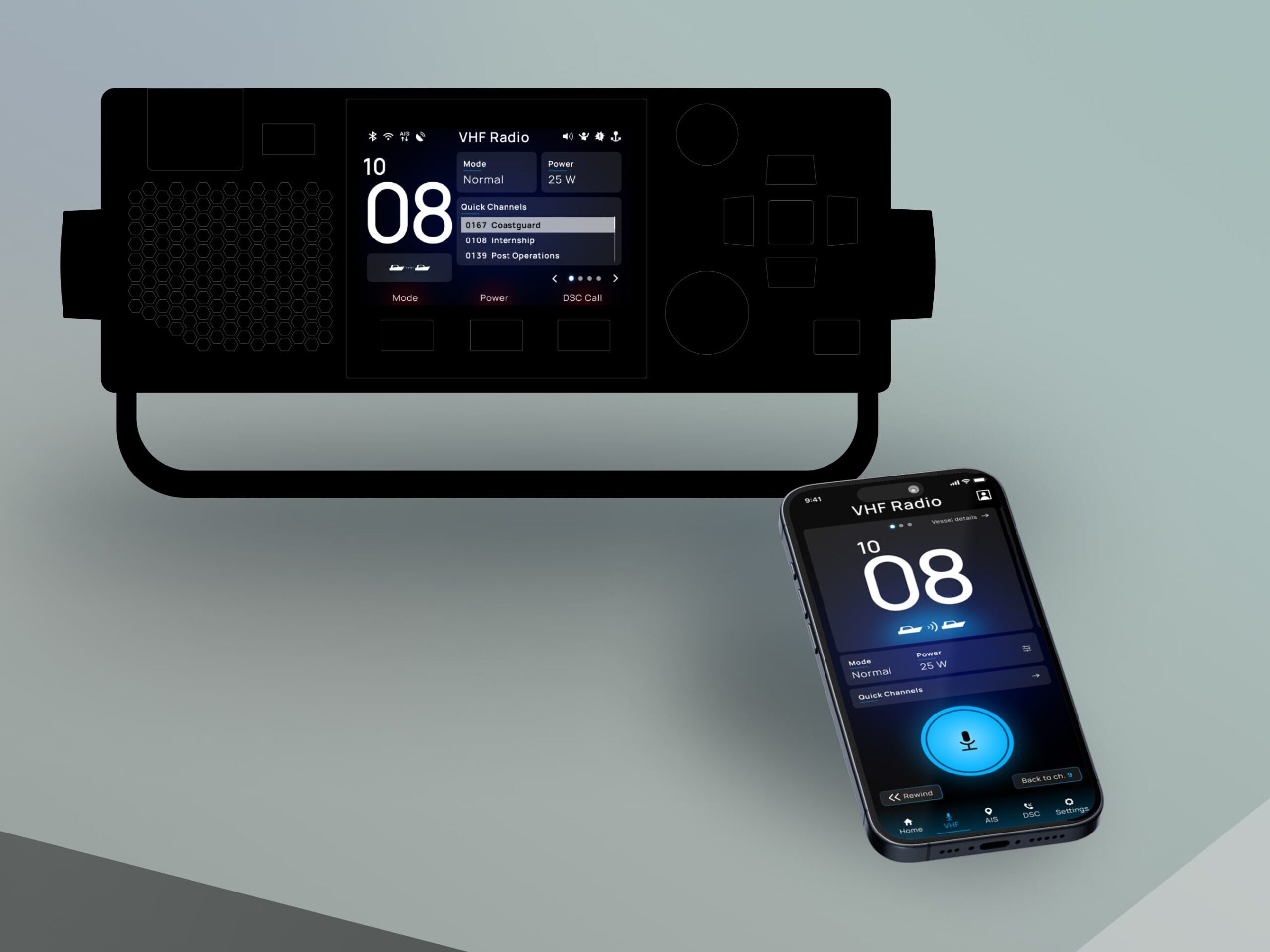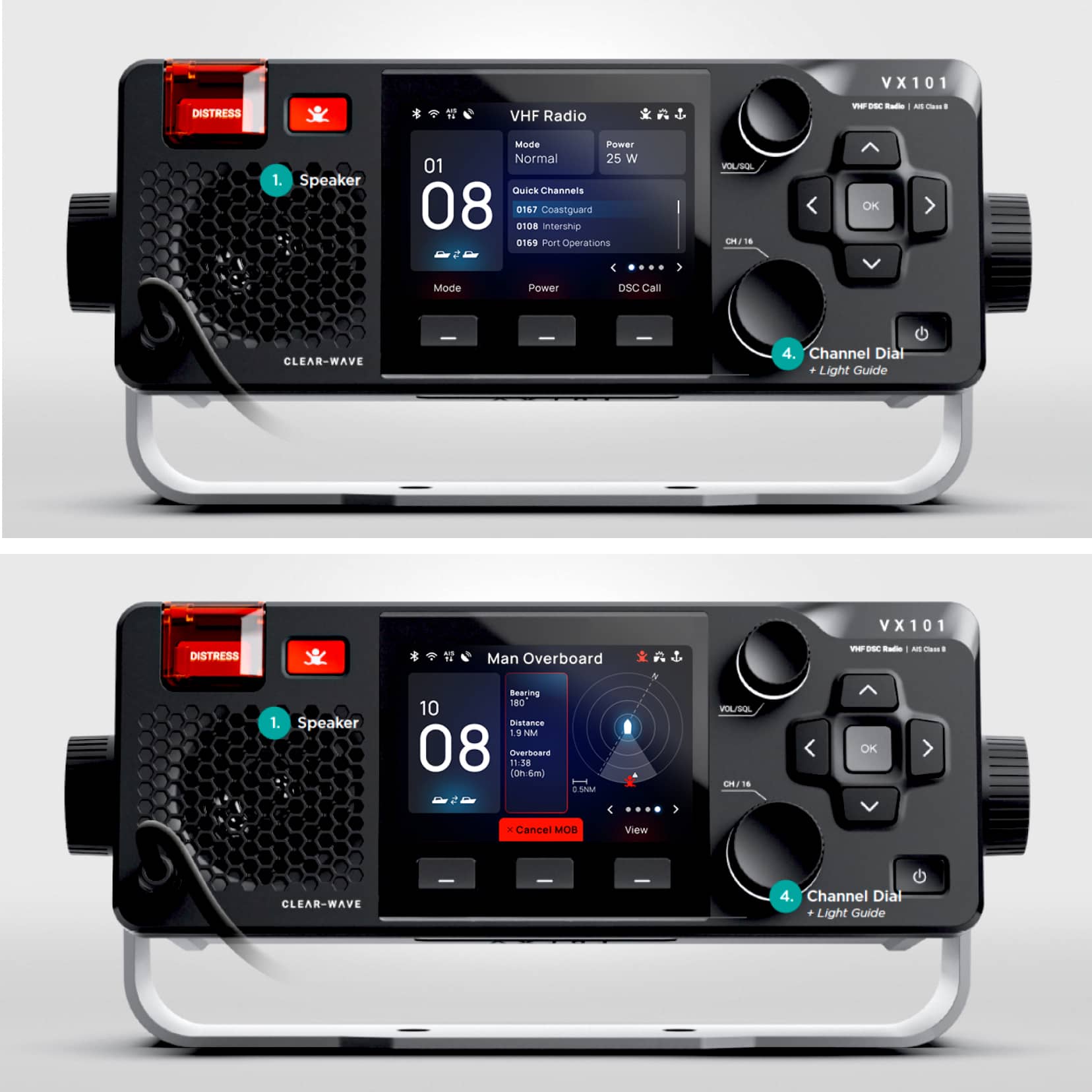
A marine radio digital interface.
This project started with a particular set of challenges, starting essentially as a re-skin task. The work that had been done before my involvment didn’t quite meet the client’s expectations and my contribution was aimed to elevate the UI to a high-end, elegant, exciting, clear and functional place.
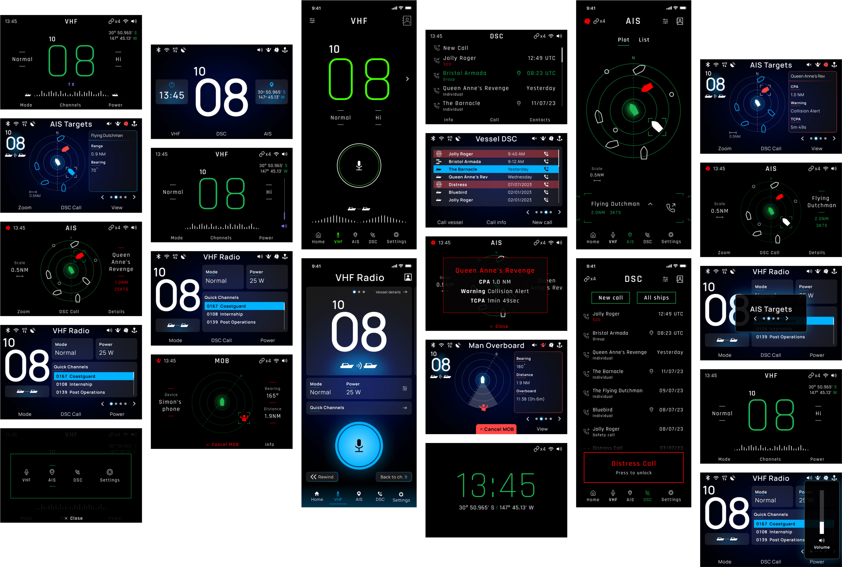
After I presented the first draft, the brief evolved into a more comprehensive and in-depth design of the whole GUI, expanding into a multi-team collaboration to bring together hardware, software and app.
Setting the mood.
Before being able to tackle the interface properly, I needed to find the right direction. The client had a good idea of what they wanted to achieve and where to set reference points.
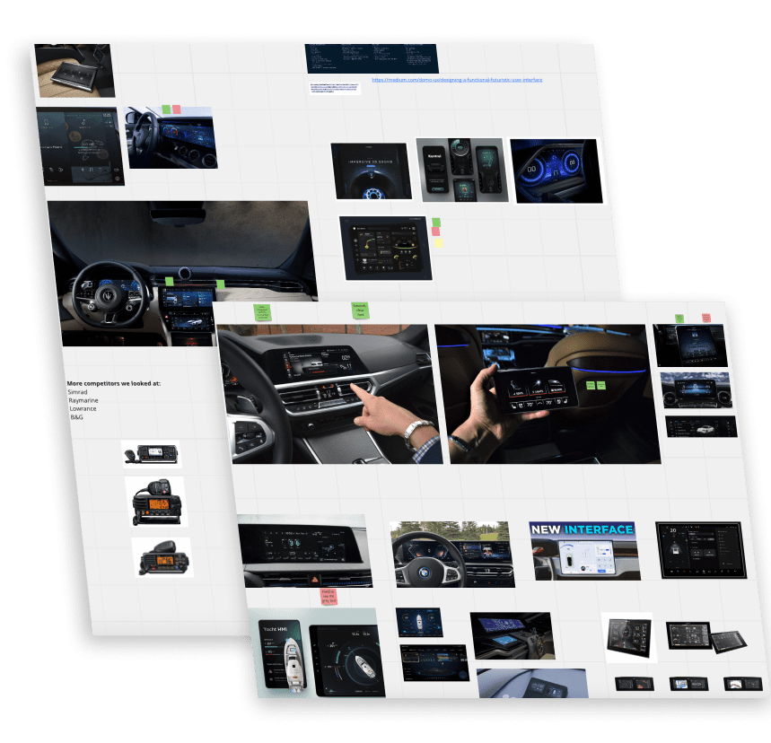
Mood boards were the first step here. Looking at competitors, as well as finding inspiration in other industries, where the ‘look & feel’ is more in line with the client’s idea, helped setting a solid foundation to the detailed work that followed. I took an opportunity in this phase to learn about the marine world, as well as about the different needs and scenarios to take in consideration when desiging a VHF/AIS device.
Organising the style.
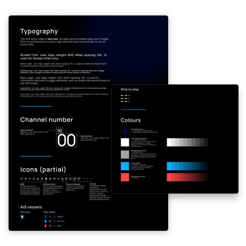
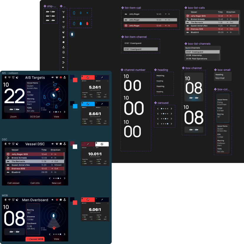
One of the strongest needs in this job was to achieve a consistent, meaningful and long-lasting design. To this objective, I made sure to document thoroughly and in a clear way the styling choices of the interface, the use of the brand and the rationale behind each visual adoption.
The client found this effort very useful, having left me fairly free to explore solutions in the first place.
Based on research and conversations with stakeholders, it was clear to me that a dark theme would be the way to go, adding a light theme on a later phase, once the design foundation was set in stone. The most recurring request I received was to have a GUI that would perfectly integrate with the hardware panel, making the digital elements almost “disappear” into the physical radio interface. To achieve this, a number of variable had to be taken in consideration, such as the screen brightness, along with the specific material used to build the different components.
Building an inclusive and accessible UI from the ground up.
The first few iterations of the interface were very well received overall. I was able to count on a strong core base, to then refine various aspects from there on. This helped me to sharpen the GUI and gave me some time to take care of a fundamental aspect of HCI: accessibility. Dealing with a range of emergencies, panic-infused situations and life-threatning scenarios, colour psychology was absolutely central. This made it imperative for the messaging to come across in the most inclusive and open way. Colour contrast, visual and audio reinforcenments, multiple cues, readability, clear iconography, plain labeling and animations were among the elements I have looked into, in the effort to create a solid and fair interface.
James Bond would love it using this!
In the original brief it was stated that the company needed to elevate the device and add to its appeal by creating a “cool” and “high tech” feel to it, like when in films we are shown impressive interfaces, used by spies in high-pressured scenes, giving us an “plausible futuristic” feeling.
The final result of this GUI was very succesful at doing exactly that. The overall look and feel elevated the whole device experience to an exciting, easy to navigate, yet comprehensive journey, with a strong accent on accessible design and inclusive delivery of information.

