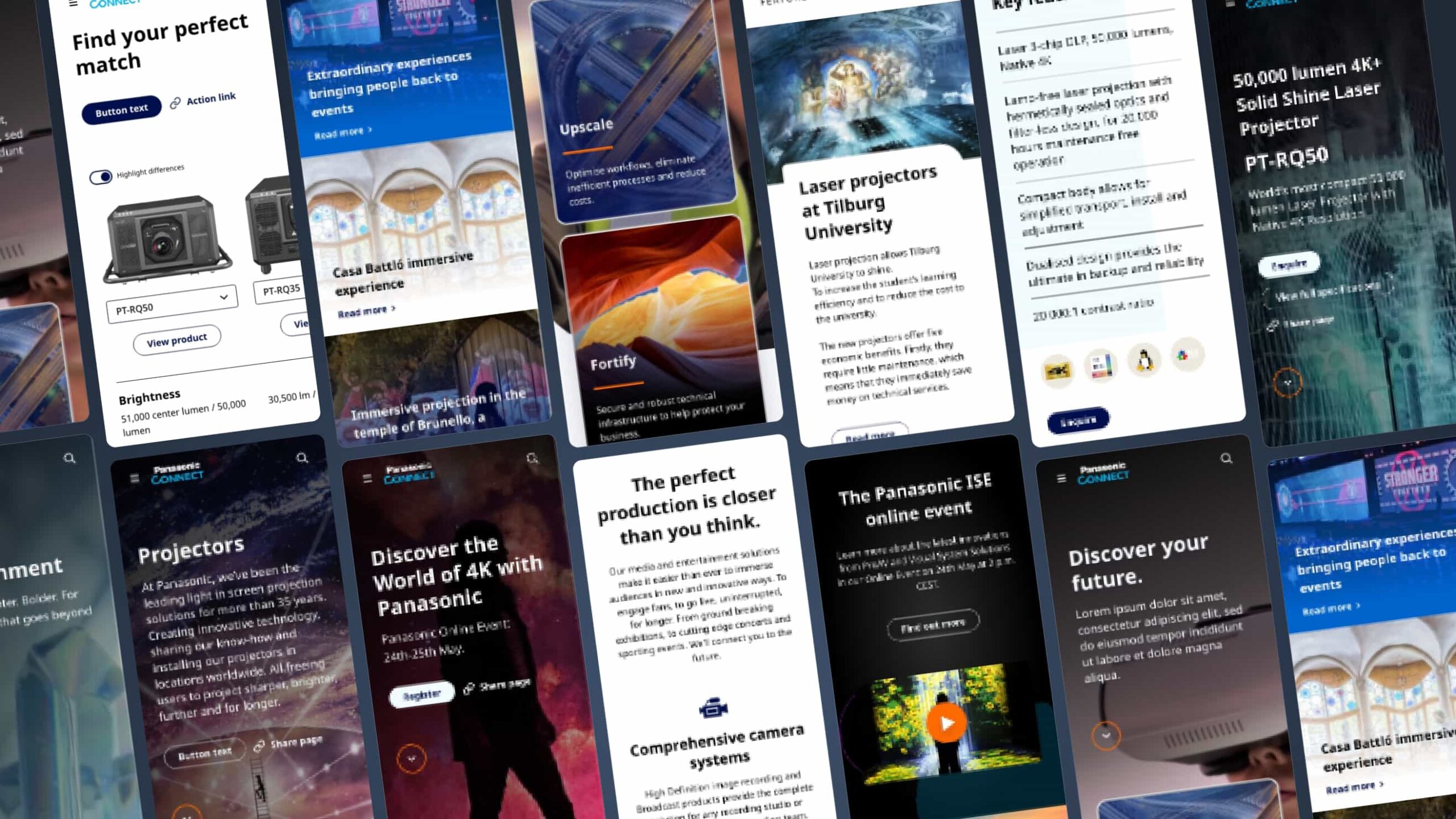
A user-centred, mobile friendly multilingual platform.
This project focus was to design and develop a modern, customer-centric, mobile-first environment that would provide the ability to share content across the European regional area for Panasonic Connect, one of the most succesful tech companies in the world. I led the design of a scalable architecture, offering a delightful experience to the front-end user, while easing the work burden of the CMS administrators and standardasing the process for content creators.
You can find the website HERE.
%
Mobile traffic
%
Visitors to product pages
The process
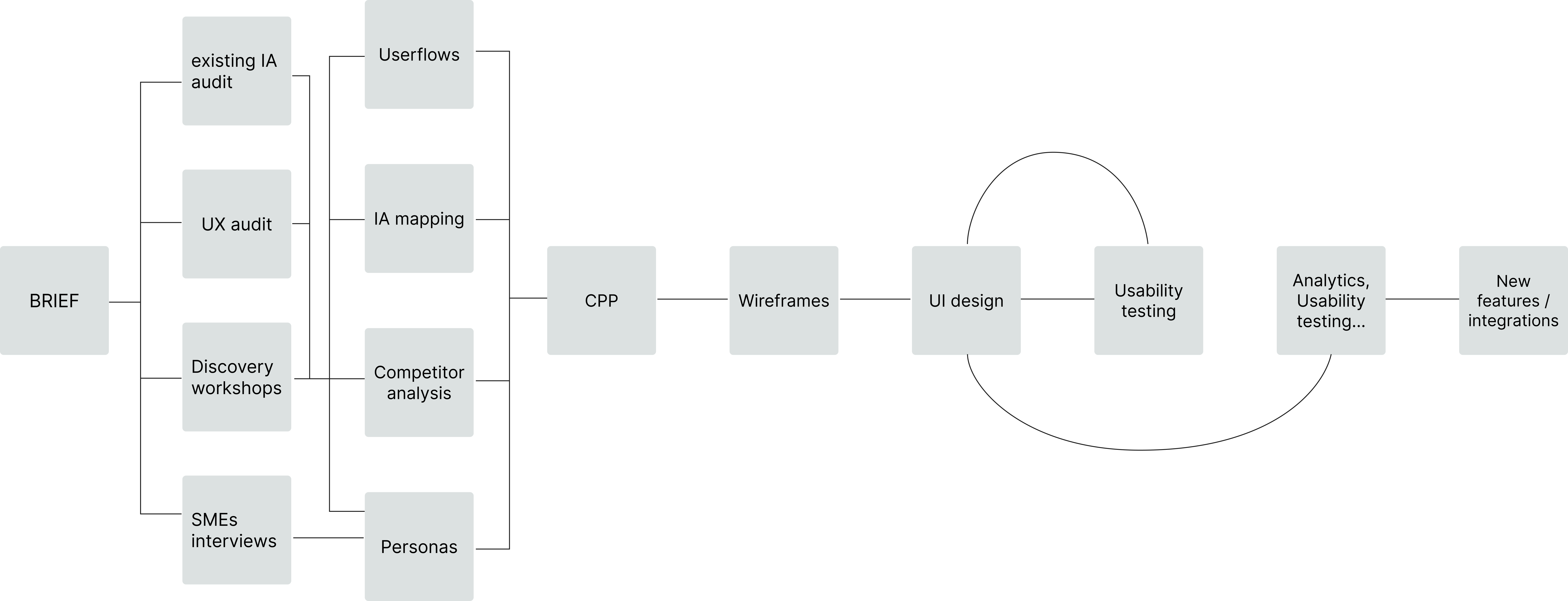
Research and discovery.
I started with a thorough analysis of the existing website, mapping the IA to identify obvious pain points to tackle, such as overly complicated paths to find basic product information.
I led the team – 2 designers, a project manager, a content strategist and a front-end developer – in the evaluation of look and feel, content and information ambiguity, as well as steps needed to achieve the user needs set by the client.
I conducted and facilitated a series of discovery workshops with the client, supporting the stakeolders groups to clearly define user needs, business goals, CMS content manager’s needs, and general expectations.
I interviewed SMEs at Panasonic and captured detailed information about the key audiences. I drafted core personas based of this information and validated them with the client.
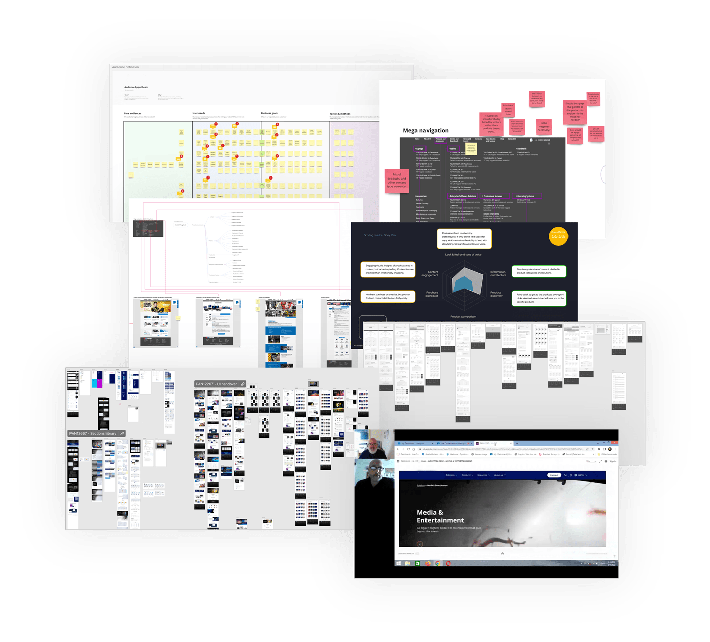
Working as a united team with the client.
Working in close partnership with the client, I carried out an extensive competitor analysis. We (me and the client’s marketing team) identified the main competitors and a set of core criteria to evaluate.
I worked with inhouse SEO experts to audit both the experience and the technical side of all the competitors. I then synthesised the findings in an in-depth and comprehensive report, offering expert recommendations on how to best tackle the identified issues.
Another big piece of work in the discovery phase was to map out the Information Architecture (IA) of the new website. The initial analysis of the existing website had provided us with a good understanding of the main pain points that needed adressing. I worked on a new navigation structure, based on simplified journeys, and then tested the changes with the construction of userflows, connecting the dots and drafting realistic scenarios the users would have to navigate through (particularly useful for QA testing as well).
The biggest structural change, compared to the old architecture, was to bring together the different business units under a global navigation system. This helped prioritising the product pages, making it significantly easier for the user to find information.
Wireframes.
Wireframes of course are a simple visual representation of the actual interface structure. In most cases, this is the first visual asset the client sees, and it marks an important piece in the project advancement.
For this project I created wireframes with a high level of fidelty to properly deliver the vision, including the interactions. The task was vast: organising the pages based on the new IA, creating a skeleton of the interconnections and presenting to the client a realistic draft of the website navigation. Me and the team worked closely with the stakeholders at Panasonic, testing the flows, collecting feedback, and amending where necessary.
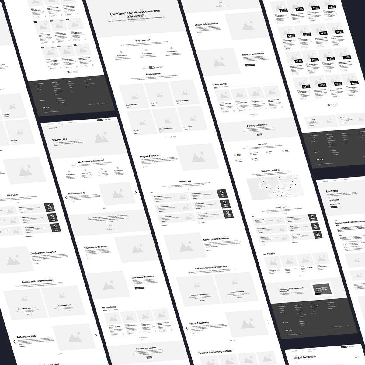
Evolution of the homepage design
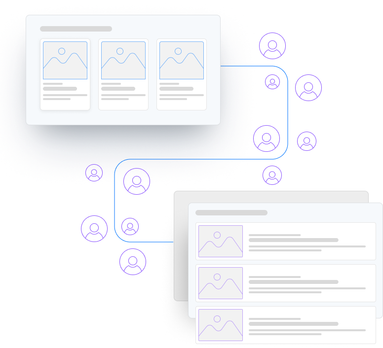
Design, test with users, reiterate.
Such a complex architecture requires a refinement process when it comes to UI. With the support of the client me and the team worked on the interface design and proposed multiple variants of the final creative direction, flexing and adapting when needed.
Usability testing was vital during the whole design phase. It helped balance out the business needs that could potentially steer the direction away from simplifying the experience, and enabled us to find solutions that would cater for stakeholders and users alike.
The element we tested and worked on the most was the navigation. The old website(s) was fragmented and built in silos. The user didn’t have any way to navigate back from specific sections to the homepage or from section to section. Our proposal intended to resolve this issue by adopting a global meganav, allowing the user to reach every part of the website at all times, with the addition of sub-navigation bars in the specific sections requiring a more in-depth level. With this structure, we also wanted to make it simpler for the user to find products and resources.
Before reaching a solution that would achieve this, as well as keeping in place the specific identities of the different business groups, we designed, tested and reiterated the navbars (on all the navigation levels) three times.
Design System
I designed every element of the components built for this project, from the atoms up. Starting from the brand guidelines, with the primary and secondary colours, I added typography, theming, spacing, elevation, interactions, iconography, all the way to more complex kitchen-sink designed components.
